Art Therapy...

My name is Kavita Gandhi and I created KavitaKriti (Creations by Kavita).

My speciality is Indian luxury hand painted silk scarves. Through KavitaKriti my hope is to create awe-inspiring silk scarves with an honest reflection of my Indian roots. Growing up I was surrounded by Indian textiles and embroideries and always marveled at the craftsmanship of what I saw. KavitaKriti is an avenue for me to pay homage to these wonderful art forms and represent them to you in my own way.

Sunday, April 22, 2012

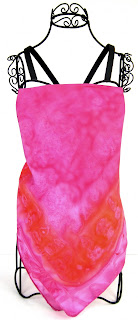
Pink and Orange: perfect Indian colors

Hand painted silk scarf, KavitaKriti, ooak ethnic scarf, indian silk scarves, bohemian gypsy scarf
KavitaKriti, indian color palette

Pink and Orange are quintessential Indian colors in my opinion.

Pink represents romance, love, fidelity, friendship and honor. Orange represents fire, lust, vigor, excitement, adventure and attraction. A typical Bollywood movie isn't it? Also the perfect color for spring... the season for L O V E. In this lovely handmade silk scarf, a pink monochromatic color scheme is accentuated with a red-orange contrast border.


The perfect colors to pair with this scarf? For a more subtle look, choose a hue from this analogous color scheme.
KavitaKriti, indian color palette
For a little oomph, pair the scarf with a hue from this triadic color scheme.
KavitaKriti, indian color palette

Friday, April 20, 2012

Complementary color scheme case study


handpainted silk scarf, ooak ethnic scarves, bohemian gypsy scarf, kavitakriti, indian silk scarveshand painted silk scarf, indian color palette, kavitakriti, complementary color scheme

Complementary color schemes use hues directly opposite each other on the color wheel. In this silk scarf, the basic colors are derived from the hues - red and green.

Contrasting colors tend to be sharp and vibrant, especially when they are used at full saturation. However I think the complementary color scheme works well in this scarf because each dominant hue is supported with a corresponding tone for balance.  Also, white is always an excellent color choice for creating a harmonious color palette.

Because of the bold colors in this scheme, I would play it safe and pair the scarf with hues from the complementary color scheme.

Saturday, April 2, 2011

Playing with Silk

This week I was in the mood to play with silk and I captured the process in a storyboard below. I tried several techniques and basically just let the silk do all the work :)
Dribbling paint, watermarks, salting, gutta work, watercolor effect, brush strokes, paint spots... basically all around good fun!

My idea was to paint alternating squares of blue and black blockprint designs with a border all around the scarf. I was going for a blockprint-batik effect and so started with two blockprint designs and traced them on the silk using clear gutta. Once the gutta dried it was on to the painting.


My color palette consisted of a sky blue, sort of lime green and black. I started with the blue blockprint squares and then filled-in the border. The green seemed too green (if that is at all possible :)), so I dulled it down with a little watered-down blue overpainted on the green and then finally gave the entire border a rinse of black resulting in this lovely dull henna color.


Next I filled in the black blockprint squares. All of the silk dyes were painted on dry silk and I let the colors flow in every which direction. The gutta lines were not solid so the colors mixed and mingled in every way possible. 


The dry silk probably stopped the dye from flowing around too much ofcourse. Finally I did a little bit of salting for texture in some of the squares and watermarks in others. I did not wipe away any of the paint spots purposely leaving them in for an uneven look. The final pictures of the scarf are displayed below and I'm quite happy with the final result. The colors work well together and the blockprint design is interesting.